Photoshop Practice
In class today we were taught how to use the program Photoshop Elements to help us create Digipaks for our Artist.We were shown an example of a Digipak created by Rebecca (who is one of the media teachers)of the up and comning artist 'Dan London, which unfortunately was an unsuccessfully Digipak.  |
This was the unsuccessful Digipak created by Rebecca. As you can see there are a number of factors that make this digipak unsuccessful such as :
Overall , I think its a poorly produced product and is a good example of what could happen when you don't follow the Do's and Don'ts when producing ancillary products |
We were then given the task to create our own Digipak for the artist 'Dan London'. We had a number of images to choose from of the artist.
For the front panel of the Digipak , I decided to use a close up of the Artist to maintain the usual style used for many artists digipak, where a close up of the artists face is used. A close up of the artist face is primarily used for a Digipak as it allows the audience to see the clear image of the artist face making them memorable to the audience. I felt that the close up image was a suitable image to use as it was clear and was a suitable sized image to use for the front panel of the digipak , giving there enough space for the font to be added.
After selecting the photo I wanted of the artist , I had to decide on a background colour for the my Digipak. I decided on the colour white as I wanted to maintain a simple , clean look for my Digipak. I also felt , that the use of the white background would allow the font and images to stand out and make it more eye catching for the audience.
I had to add a layer inorder to separate the background colour and the image of the artist. This was to make sure that if I made any changes to the background , it would not effect the artist image.
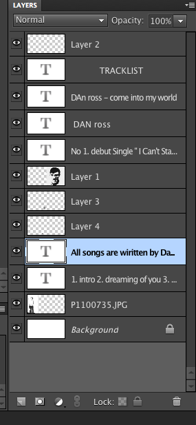 |
| This screenshot is of the all the layers added to the Digipak. I had to create all these layers or in-order to separate the images , the fonts used and the background colour. I had to ensure that the font layers were places in order above the background colour and images in-order for the fonts to be seen on the Digipak |
 |
| This Screen shots illustrates the effects that were added on the two images. |
The text found on the front panel includes: the artist name , album name and the name of Dan London's hit single ' I Can't Stand The Fame', The text found on the back panel of the album include: a tracklist and the copyright information regarding the album.
The back panel of the album included the logo of the record label associated with the artist and a barcode logo.
In contrast to the previous digipak of the artist Dan London , I feel my digipak
 |
This screenshot is the finished product of my digipak for the artist 'Dan London'. I feel that with this practise of using the Photoshop Elements program , I will be more comfortable when creating my own Digipak for my own artist. I feel that with this practise I have learnt the key features of how to add effect on to images , how to add text and to add layers in-order to allow the features to be seen on the design. I feel that I am more prepared when having to use this program in the future. |
No comments:
Post a Comment